
We were engaged by SA Mushrooms to redevelop its brand identity and packaging system. The project's aim was to update the organisation's market positioning and brand proposition to reflect their growth from a small, family-owned produce farm to a national supplier of mushrooms to major supermarkets, independent greengrocers and produce markets.
- In this case study
- Brand Identity


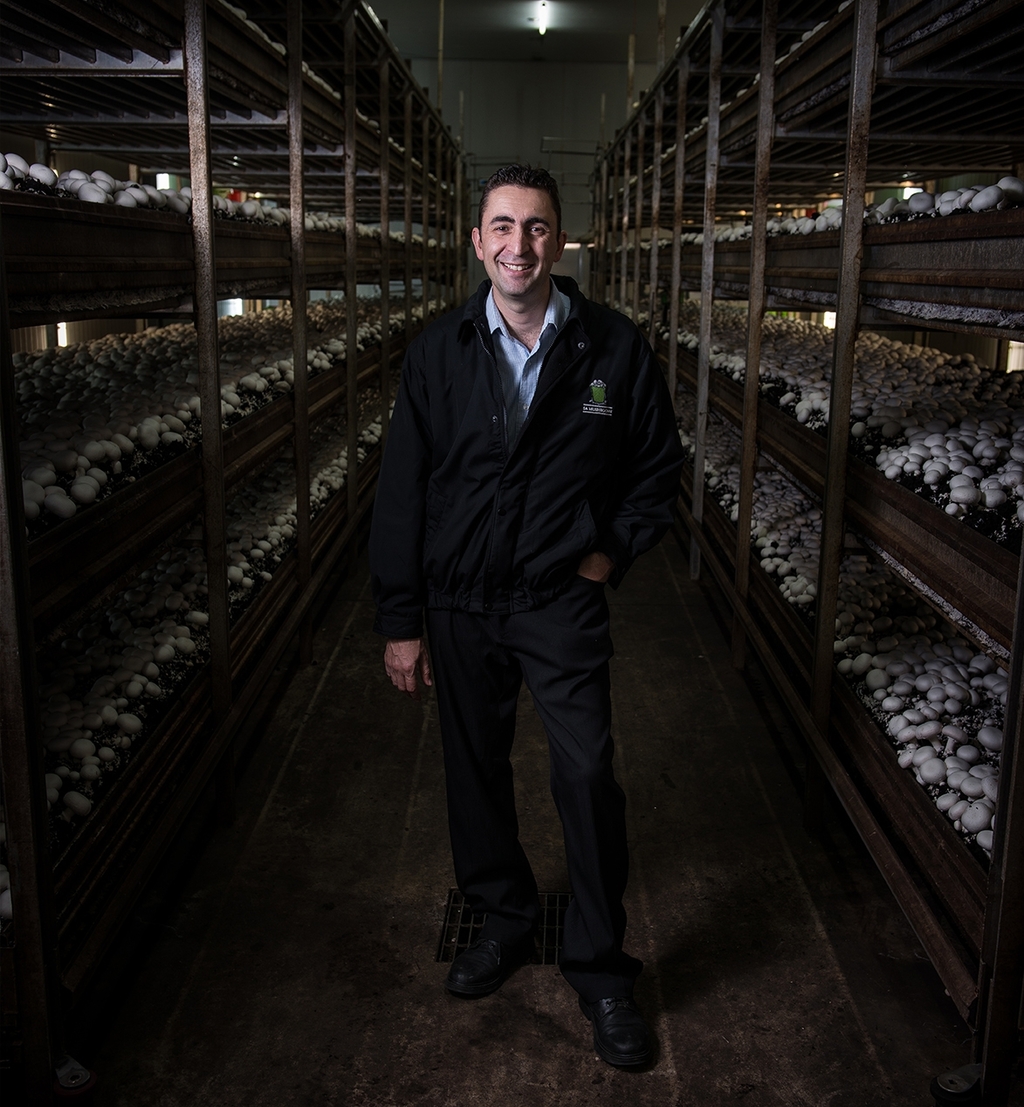

After visiting and observing the organisation's expansive production facilities in the heart of the Adelaide plains, we were surprised to find that SA Mushrooms' mushrooms are hand picked. Once picked, they are placed into cardboard crates and the next hands that touch them are those of consumers at the point of sale—often just hours later. There was clear disparity between the previous brand identity and the traditional, local and hands-on practices of the organisation. The previous brand identity, a smiling clipart style mushroom, appeared unconsidered and failed to reflect this brand proposition.
While it's standard across the industry for mushrooms to be hand picked, the inclusion of the "delicately hand picked" positioning statement prominently as a part of the brand identity and across packaging implies a higher quality, less processed product than those surrounding it on supermarket shelves.
A broader brand strategy was developed to incorporate a hand illustrated style for all assets (including the brand identity itself as well all headline typography to be used going forward). This represents the traditional, hands on approach of the organisation and an attention to detail. The brand identity incorporates a mushroom-filled bucket, symbolic of the traditional mushroom picking process.