How do you rebrand a winery?
Start with a lovely red and blend
delicious yellows, blues and pinks.
Penley —formerly Penley Estate— is a family-owned winery based in Coonawarra, South Australia, a region famous for its red wines and strip of terra rossa “red soil”.
- In this case study
- Advertising
- Brand Identity
- Graphic Design
- Film + Photography
- Strategy

Blending wine and lifestyle
to create winestyle.
The wine industry loves talking about itself: the winemaker, the region, the vineyard, the barrels, the history. Penley wasn’t innocent, though they were ready for a change. Together, we redefined how a modern wine brand behaves.
We built a brand that people want to be part of. One that’s bold, progressive, fearless and full of character. A brand that blends wine and lifestyle together, talking more about the drinker and the occasion than the wine itself.
Making a good vintage,
a little vintage.
In an industry where black and gold runs rampant for premium wine brands, Penley’s palette lets it hair down and splashes colour around with a drop of red. Then, by mixing in a nod to 90s nostalgia through the art direction, Penley’s able to directly connect with the people it’s got its eye on.
Pairs well with,
well, everything.
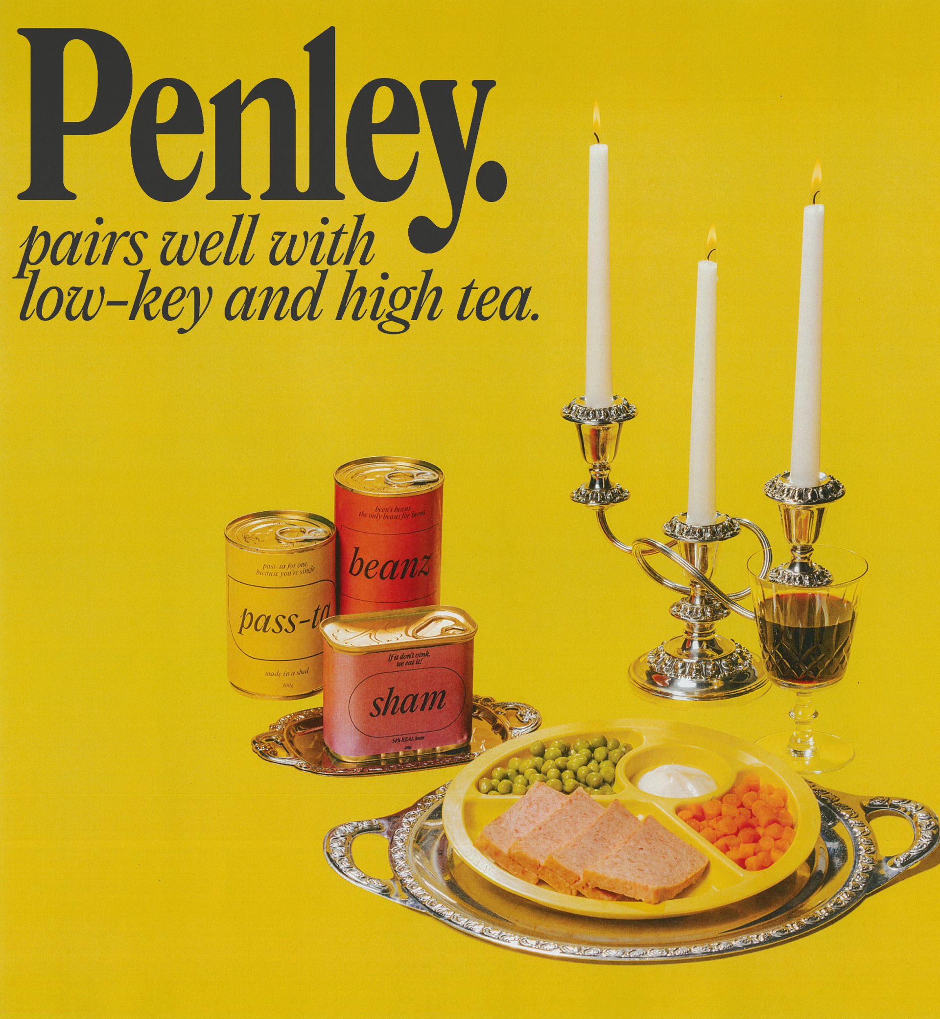
It’s common to hear what a wine pairs best with, though instead of always pairing with flavours, we’re pairing Penley with practically everything through their tagline and brand campaign “Pairs well with”. Stilettos or sandals, bow ties or boardshorts, planned or impromptu, Penley always finds a way to fit in.

Putting sustainability first
whilst still making Penley
the pick of the bunch.
The brand may take cues from eras gone, though Penley’s approach to packaging is focused only on the future. A lighter-weight glass bottle and 100% screen printed label means that the bottle doesn’t risk heading to landfill after being polished off.
Penley’s new packaging design system brings the wordmark to the fore, making it the hero of each bottle and redefining what a premium wine could look like on the shelf.
A tone of voice
that’s
easier to swallow.
Wine language can be a mouthful. We crafted Penley's tone of voice to be a little more palatable, catering to the wine drinkers — not the wine thinkers. Never spitting out wanky wine terms, Penley talks in a language we can all understand.
Awards?
We crushed it.
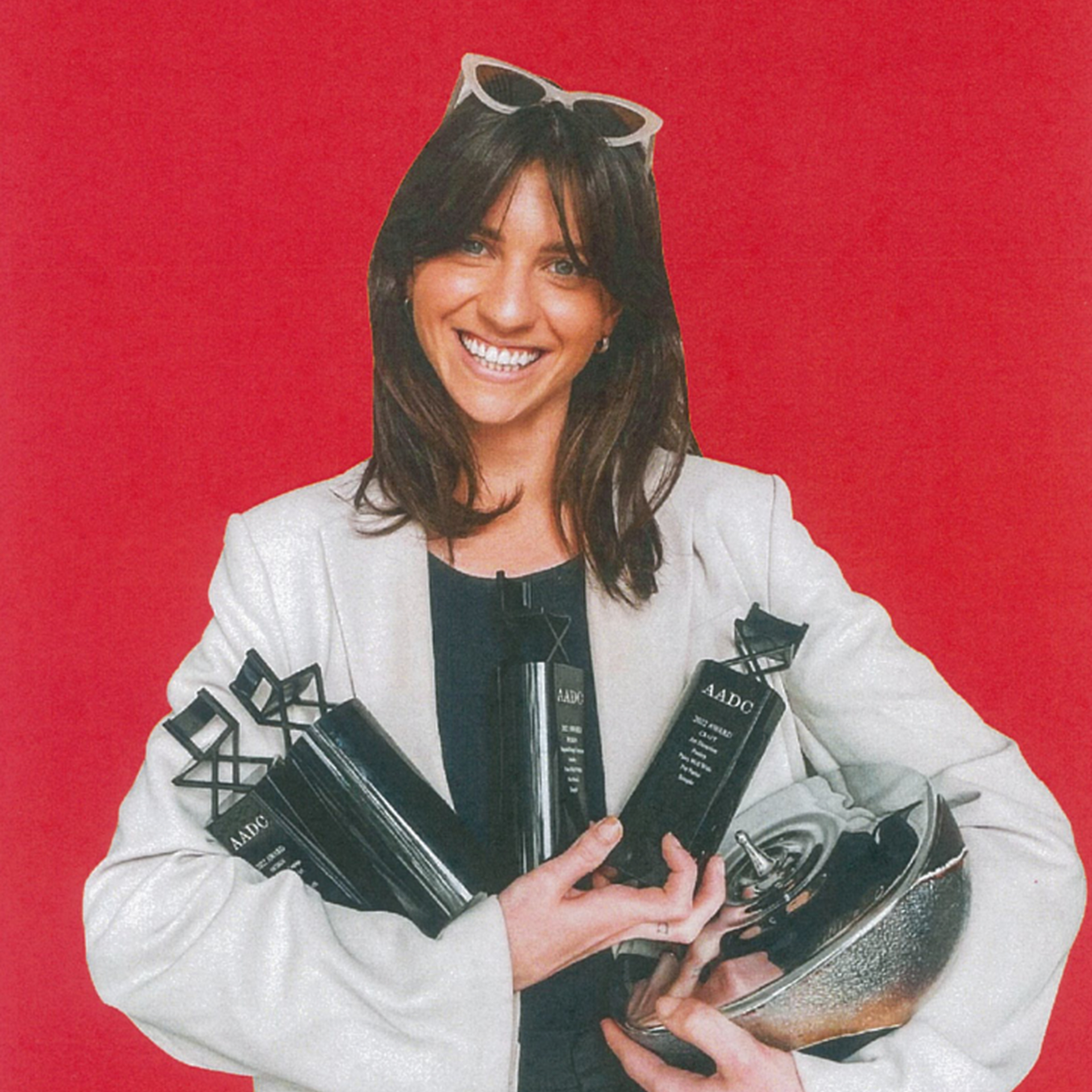
CHAIR — Integrated Design Campaign — AADC (2022)
AWARD — Art Direction — AADC (2022)
AWARD — Brand Identity (Small Boutique) — AADC (2022)
AWARD — Integrated Design Campaign — AADC (2022)
AWARD — Wine, Beer & Spirits Packaging — AADC (2022)
FINALIST — Photography — AADC (2022)

Meet the makers.
The spills and thrills
behind the Penley brand.
Bringing the new Penley brand to life was a little like crafting a good drop. We experimented, tested, and gave our ideas time to mature. We went in search of the perfect objects to pair Penley with, and were relentless in creating something brave.


